topicofthought

Greta Zukauskaite, COMM-105-002

The (concise)History of DC Comics

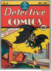
On January 11th, 1935, Malcom Wheeler-Nicolson and Jack Liebowitz, who led National Allied Publications, debuted New Fun: The Big Comic Magazine #1  followed by Adventure Comics, and lastly Detective Comics. Soon enough, National Allied Publications took on a new partners, one of which was Harry Donnenfeld, and formed DC comics named after their last title “Detective Comics.” The first superhero of DC comics was Superman, the creation of two 17 year old Jewish teens from Detroit. The creators of Superman had their idea of the superhero rejected countless times before DC comics decided to take on the idea.

Soon enough, Superman blew up to be one of the biggest figures in the country. By the third issue, one million copies had been sold. From 1939-1940 there was a mania surrounding Superman. He was the perfect example of an American, a foreigner with two identities. Meek and timid in public, but behind his cape, he had the powers to save the world from new crimes. Crimes represented in the comic reflected those that were currently emerging in society as well.

A few years later, Bob Kane designed Batman, a mortal with no superpowers, but who soon rivaled superman in popularity. Around the same time, DC comics hired a psychologist who criticized the company for not reaching their full potential. As a result, Wonder Woman was created as the mother figure of the superheroes already present. Even though there is debate about whether Super Woman’s role was truly that of empowering women (since many comics depict her tied up), she is still considered a favorite.

Many other superheroes emerged in the first “Golden Age” of DC comics. In the 50s, DC comics went through a revamping of of the superheroes. Soon enough, more superheroes, super “groups” even were being added as well as villains. Superman had Lex, Batman had the Joker, and so on and so forth. Kid sidekicks like Robin Hood also became a trend in the comic scene.

DC comics extended and grew to include the current times and current issues facing society. The company also moved from comics, to shows, to popular movies like the recent Dark Knight.

The beauty of comics is that they have the ability to stay current in ever-changing times. People who knew about Superman 75 years ago, still know about him today. Timeless and evolving are two words that can describe this artful treasure.

Now I was never a fan of comics or superheroes, but this video definitely made me reconsider. If I had to choose one favorite it would have to be Superman. I remember reading an article about the superhero in my College Writing class and I was able to draw many similarities between him and the traits on an immigrant like myself. Who wouldn’t want to be able to get rid of their meek and timid identity and be able to save the world one adventure at a time?

(All information was taken from Secret Origin: The Story of DC Comics. I was able to rent it off iTunes and watch it again!)

Picture from: http://www.luxist.com/2010/02/10/batman-tops-supermans-rare-comic-book-record/
Pride and Prejudice(BBC version) vs. The Piano

Pride and Prejudice and The Piano are both stories that have the theme of love and marriage streamlining the story lines. In Pride and Prejudice, Elizabeth Benton is pressured to marry for social status while in The Piano, Ada Mcgrath experiences an arranged marriage and is sent to New Zealand.

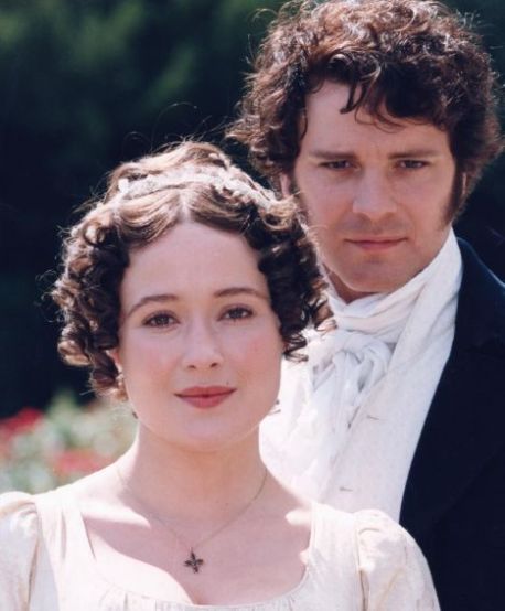
Both movies express their story lines but in very different manners. Pride and Prejudice is mostly made up of dialogues, speeches, and narratives. Dialogue between characters is often very detailed, long, and descriptive. The actual visual elements of Pride and Prejudice lack much movement. Scenes are simple and not very dramatic. Most of the “drama” of the movie is displayed through the verbal communication between characters.

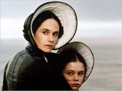
In The Piano, the protagonist, Ada Mcgrath is a mute. This means she can’t speak. Even though the main character of the film can’t express herself through words, she does so by way of facial expressions and emotions. The visual elements in The Piano differ greatly from those in Pride and PrejudiceThe Piano uses more emphasis on lighting, the zoom of the camera, switches in frames, and other elements more than Pride and Prejudice. This needs to be done because the plot has to be revealed through everything besides verbal communication.

Although both movies have very different ways of presenting their stories creatively, it is solely based on opinion which is better. Personally, I enjoyed The Piano because I favor movies that can capture my attention and my heart through visuals rather than just dialogue.

Image

From: http://blogs.dailyprincetonian.com/intersections/2011/11/18/ufo-the-piano-1993/

Image

From: http://thesecretunderstandingofthehearts.blogspot.com/2010/09/how-much-jane-is-there-in-bridjet.html

#6, The Chinese Dragon

Last week I got the chance to visit the Textile Museum in Northwest DC where an exhibit called “Dragons, Nagas, and Creatures of the Deep” was on display. For the short amount of time I could stay, I learned that the dragon was possibly the most important symbol in the Chinese culture. It was also appropriate to learn more about the creature since 2012 has entered the Year of the Dragon.

It is interesting to note the different perceptions of dragons from around the world. In Western culture, the dragon is looked at as an evil creature, often times being killed by some sort of hero. In Chinese culture, that perception would be totally unusual. The Chinese themselves call their civilization the “descendants of the dragon.”(The Almighty Dragon) The dragon is regarded as a symbol of almost all the adjectives you could use to describe someone with power, excellence, nobility, and divinity.(The Almighty Dragon) Emperors regarded themselves as “real dragons” since they were the closest living thing to divine power, and took the symbol to emphasize this fact. If someone was complimented as being a “dragon” or “dragon-like” that would be taken as the highest form of a compliment.(The Almighty Dragon)

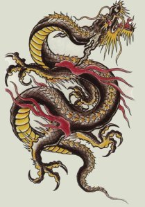
The dragons mythical powers were those that had to do with water. The dragon, unlike many people know, is a water symbol. In Chinese culture, dragons are believed to control rain and floods. The tail of the dragon, the culture believes, was used to makes waves in rivers and effect weather patterns. The build of the dragon itself is said to come from many other animal parts. Some of these include the horns of a deer, head of a camel, eyes of the devil, neck of a snake, abdomen of a large cockle, scales of a carp, claws of an eagle, paws of a tiger and ears of an ox.(The Almighty Dragon)

There are many different forms of dragons with many different powers. One of these powers is helping to transport humans to their celestial world after they pass away. Currently, we are in the year of the water dragon.

Dragons today are used in celebrations such as the Chinese New Year. Elaborate dragons are held on sticks of different materials and different sizes and are used to dance as a symbol of celebration.(Dragon Article)

Picture from: http://www.draconika.com/chinese.php

Works Cited

“The Almighty Dragon.” http://www.chinaculture.org. Web. 6 March 2012.

“Dragon Article: The Celestial Dragon.” www.cdot.org. Web. 6 March 2012.

#5, Newseum and Image Critique

Having been to the Newseum before, I was extremely excited to go again. Despite the fact that I had some trouble with arriving there, once I did I remembered why I loved the attraction so much. First, it is extremely aesthetically pleasing. When you approach the museum from the outside, it seems both out of place yet perfect where it is. The giant quote on the front of the building caught my attention as well. My favorite parts of the museum included the display of the front pages of newspapers from all around the world. I snapped a picture of my native country’s newspaper (Lithuania) as well. My other favorite exhibit was the 9/11 one. Even though it was contained in a small space, the headlines from newspapers from all around the world, along with the pictures and actual piece of the World Trade Center portrays the emotions of the day vividly. Over all, just like before, I loved my Newseum experience.

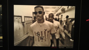
The picture that I chose for my critique was exhibited in the Pulitzer Prize winning section of the Newseum. When looking for images to write about, I immediately look for something that I can connect to personally. This picture is titled “High School” and was featured in 1989 in the Detroit Free Press.

This picture  caught my eye for a few reasons. First, it wasn’t a picture about war, or fighting, fires, or anything out of the ordinary like some of the other featured photographs were. It is a picture of a basic day in a high school, which I could personally relate to. The picture itself is not black and white but has a warmth to it that both makes the picture look a bit dingy and reminds me of how a high school hallway would feel: a bit dirty, comfortable, and familiar. The main subjects in the photo are two boys who are centered. The first boy is wearing sunglasses and a T-shirt you would see any teenager wear. For some reason, the picture grasps the effortless “cool” the first boy is exhibiting. Although he is in a high school hallway, that isn’t stopping him from wearing what he wants to wear. He is on the move, not phased by the photographer. The boy in the back is blurred, which adds an element of motion to the picture. Regardless of whether the boy is following the one in front or not, the movement adds life to the photo. It is as if the fast-paced high school day is perfectly portrayed in the motion of this picture.

I also enjoyed the other parts of the photo which pictured lockers, a high school clock, and other students in the back going about their business. The entire photo itself is a bit out of focus, which again symbolizes a typical day in high school. It is busy, familiar, and filled with teenagers who are always on the move and always expressing themselves, even if it means wearing sunglasses indoors. It truly makes me miss my high school environment.

#4, Propoganda

Since the assignment was to create our own piece of propaganda, first I began at looking through old examples and then new ones. Older propaganda was often times more explicitly seen as propaganda and in your face like the “I want YOU!” posters to join the war in the USA. Today, propaganda stems from all areas. You can see it in movie theaters where previews show appealing battle scenes which persuade people to join the army, or you can see it walking down the street in an advertisement where a company is trying to persuade you to buy their brand.

If you search “propaganda” in an engine like Google today, you will most likely see satirical and sarcastic propaganda poking fun at certain political and social issues. This is where my piece stems from.

I decided to draw my own piece and center it around the idea of the war on drugs in the USA and specifically marijuana. The poster shoes a cannabis plant with a big red “x” on it and a caption that says “Just Because.” This poster is meant to be critical of people who oppose marijuana use and laws against it. The quote “Just Because” emphasizes that lack of explanation that people have when speaking about their opposition to marijuana and why it should stay illegal. It capitalizes on the conflict between allowing medicinal marijuana use because it is known to be helpful for many ailments, but also focuses on the reason it is still illegal, that being “Just Because” they can’t verbalize their argument in another way.

The colors used for the poster are simple: black, green, red, and  pale yellow. The black frame draws your attention to the center of the poster. The red “x” as well as the wording are meant to look powerful, as if an extremely strong statement is being made. In reality, the opposite is happening. You would expect the highly simple and eye-catching poster to make a solid statement, but it does just the opposite. The colors reg, green, and yellow all together also represent the colors of Rasta, a movement which involves the using of marijuana for spiritual cleansing.

Overall, the poster is neither truly rejecting marijuana use, nor is it promoting it. It is simply bringing awareness to the issue of arguments about marijuana, specifically to the camp of people who oppose legalization of the substance.

#3, Pharrell Williams and A.$.A.P. Rocky


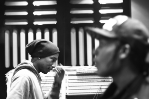
I chose this picture from a cultural perspective with the focus being the culture of Hip-Hop and it’s history. The people in this picture are Pharrell Williams, a veteran in the music industry, and A.$.V.P. Rocky, who is what you can consider a “freshman”. I chose this picture specifically because of who the two people are, where it was taken, and what it means for the music industry. Pharrell Williams has been making music since the early 2000’s and even before then. He has worked with countless artists and made himself an original icon. A.$.V.P. Rocky, on the other hand, is completely new to the industry and it is refreshing to see a veteran and a rookie working in the studio together. This picture represents two artists with two completely different styles coming together and collaborating on a potential musical project. It is the old and the new mixing together to form something unthought of, with is truly refreshing in the Hip-Hop community.

The picture itself is in black and white, in a way, grasps the true meaning of what is really going on in this picture rather than being distracted by the color that would otherwise be there. The focus is on Pharrell, while A.$.V.P. is blurred out, but still in the picture. I picked a picture with Pharrell in focus because of the implications that a veteran being present in the same studio as a rookie has.

#2, Mac Ad

Shannon and I’s take on an advertisement for an Apple Mac laptop geared towards “artsy college students.”

“Greta-2012” Lion’s Head, South Africa

I took this picture after completing a challenging hike in the city of Cape Town, South Africa this past winter break. When people finish the hike, they are welcome to sign their names on a structure right at the top. Since I wasn’t sure if I was ever going to return to that special spot on top of Lion’s Head mountain, I wanted to take a picture to remember both that day and the trip as a whole. When I took this picture, I was intentionally trying to have my name, Greta, in focus and the background out of focus, which includes a blurred out visual of people and Table Head Mountain. I wanted my name, which is clear and lit up by the natural light of the sunset to be seen. It symbolized my accomplishment of not only climbing that mountain, but taking the risk of going to South Africa, trying something new, and as this picture shows, making my mark on a completely different continent. The light from the sunset hit my name at a perfect angle, and represented more than just the end of a day, but the completion of an unforgettable trip. When I take pictures, I try to have a good balance in composition. I tried to achieve this in this picture as well.